
Judging a book by its cover: the art of late modern book cover design
October 16, 2015
Building on yesterday’s story about movie titles, I wanted to share this mesmerizing work by Henning Lederer. Henning is a German designer and animator who has made some really beautiful films (like this animated version of Fritz Kahn’s Der Mensch als Industriepalast poster [Man as Industrial Palace]). The piece that really caught my eye is his most recent, called Covers, which animates a collection of 1960s and 70s classic book covers:
Covers by Henning M. Lederer
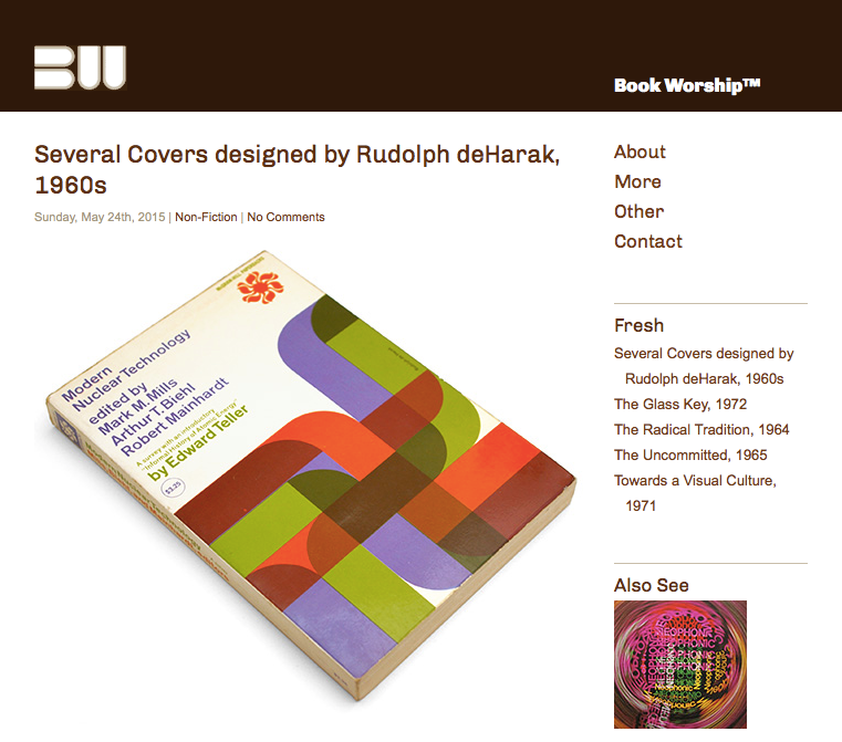
So…mesmerizing. I was curious about who had designed the covers, which led me to follow Henning’s links from Vimeo to Book Worship, where the rest of my night basically vanished.
Book Worship is maintained by Shawn Hazen, who says:
This site represents the obsessions of an atypical book collector. While I certainly love “valuable” books, that’s not necessarily what you’ll see here. For the most part, these are graphically interesting, but otherwise uncollectible, books that entered and exited bookstores quietly in the 50s, 60s, and 70s. I read a lot of these books, but my motivations for posting them here are primarily visual, since I’m a graphic designer. That’s why it’ll be a bit of a mixed bag.
I love the Internet. Where else could someone celebrate their love of an obscure topic and find an entire community that feels the same way? Shawn‘s obviously a designer after my own heart, because he also maintains the very cool Typophonic, a site all about record cover typography, and ChicagoType, which archives type seen around Chicago (though it appears Shawn has recently moved to Seattle, so maybe there’s a SeattleType in the near future?).
Henning also links to Montague Projects, where you’ll find another excellent archive of book designs from the same period.
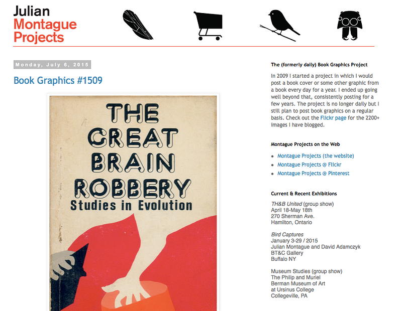
Does the hand on the cover of The Great Brain Robbery look a lot like Saul Bass’ title from The Man with the Golden Arm or is it just me?
The site is maintained by Julian Montague, a Buffalo NY based graphic designer and artist. Julian wrote a fascinating sounding book called The Stray Shopping Carts of Eastern North America: A Guide to Field Identification [Amazon Associates link], which you can buy on Amazon if you have stray shopping carts you need to identify.
I grew up in a home that was filled with books of all different descriptions. My parents are both avid readers — my Mom devours fiction while my Dad also loves non — and I’ve been reading as long as I can remember. Our collection certainly numbers well into the hundreds of books, and I spent many hours browsing through them as a kid (and as an adult whenever I’m at my Dad’s!). Although I didn’t recognize any of the specific covers Henning used, we do have many books that fit the stylistic genre of esoteric-title-paired-with-random-graphic-heavy-colorful-image.
The more I write about design, the easier it becomes to tease out the threads that have run through its history. I have a beautiful framed Popchart Labs poster in my home office, another design-themed gift from Bianca, that sums up the history of graphic design:
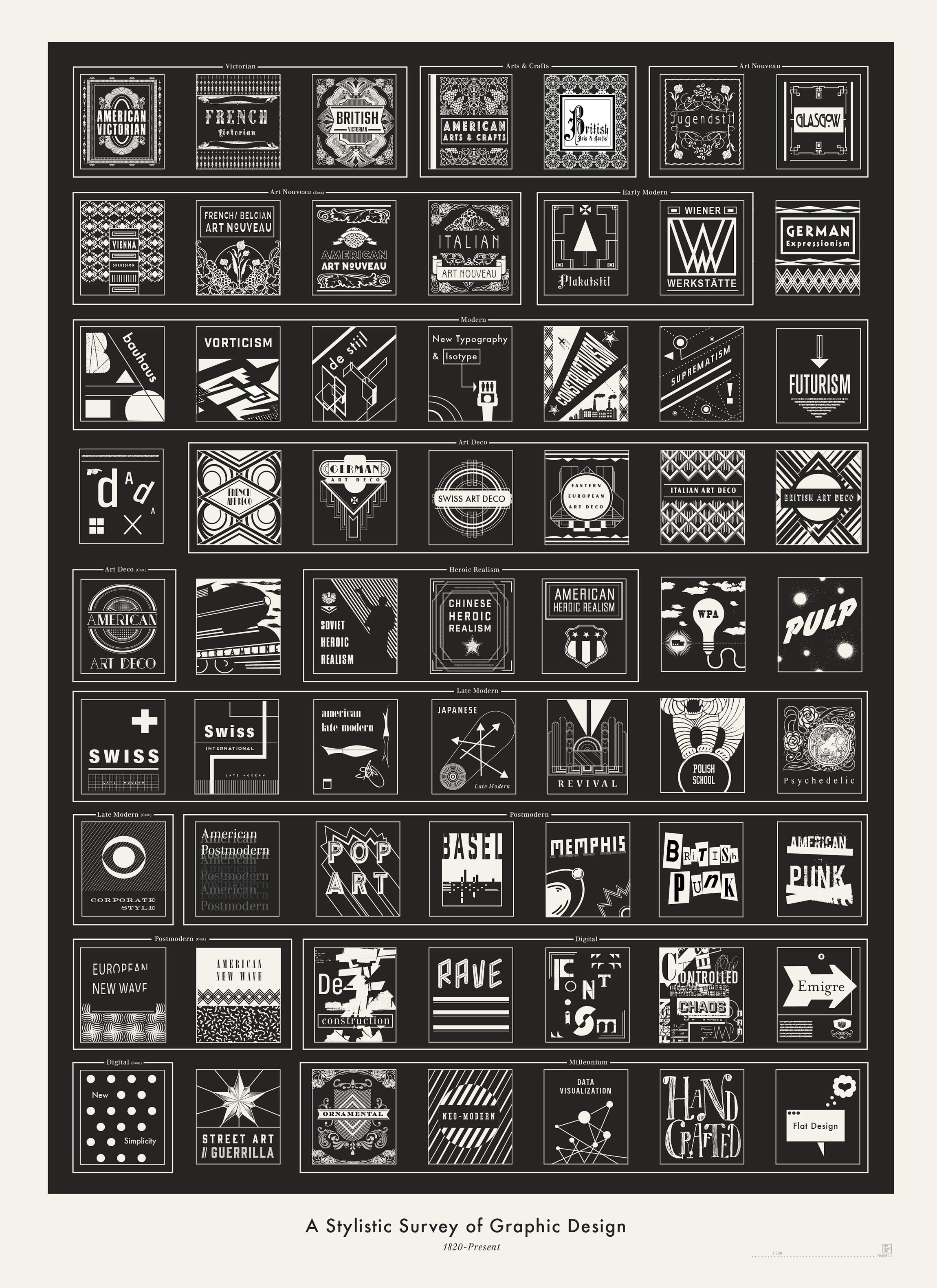
I identify much more strongly with some of the styles and eras listed: the Vienna Secession and Bauhaus for their beautiful and modern buildings, Isotype for really founding the world of infographics, all the art decos for their lines and symmetry (and for beautiful venues like The Carlu, wherein we tied the knot as symmetrically and cleanly as possibly). Late Modern is really where I feel the most connection, and also where these book covers and yesterday’s movie posters fall. It’s the era that brought us Dior, Frank Lloyd Wright, Vespa scooters and James Dean’s infamous Porsche 356, Saul Bass and Paul Rand, and the madness of Mad Men. Advances in printing technology had suddenly made possible a whole new world and those designers were quick to jump into it, layering new colors and printing techniques as fast as they could be invented.
I missed all of that by a generation (or two), but the closest I encountered myself was the early years of Wired Magazine under the design stewardship of John Plunkett and Barbara Kuhr (Plunkett+Kuhr). They threw every new metallic or neon ink onto those pages, layered into almost unreadable collages of techno-fetishism. Maybe my daughter will one day flip through my old Wireds with same feeling of inherited design nostalgia with which I once perused my Dad’s book collection.
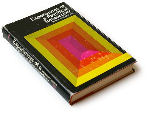
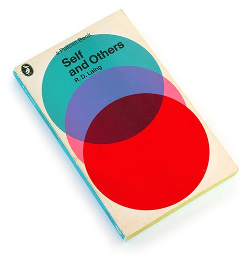
I’ll end with a sample of covers from Book Worship that caught my eye — enjoy!


Subscribe to JayGoldman.com
Get occasional email updates when I write new posts or have things to share. Unsubscribe anytime.